HRLocker is a modern people management platform to help Managers and Employees to thrive at work.
What I worked on:
UX research
Workshop facilitation
User journey maps
User interface system
I carried out UX research to validate the performance review feature which had not met adoption targets set out by the product owners and designed a UI system to reduce timelines to launch.
Usability testing
At the point when I was invited to the project, the performance review feature had been deployed for a number of months, however there were conflicting views within the product team as to why the feature had not received more interest?
I used an online testing platform to deliver the tests in a quick turnaround time.
I designed and facilitated a series of usability tests for all user types with the aim of first; understanding their semantic association with the name 'RTR' (a.k.a. Real Time Reviews) and second; finding out if the feature matched the users mental models on what a performance review feature should do? The test users were then asked to provide overall feedback on their experience.
What became immediately obvious was that many users simply didn't understand the meaning of 'RTR', and simply by passed it in the navigation.
Aligning the product owners
It crucial to bring the product owners on this journey of discovery. I shared the test recordings with the team and scheduled a series of affinity diagramming workshops using the KJ method to bring together all observations and reach a shared understanding of what was really going on with the Reviews feature. There were plenty of 'oh-wow' moments which ultimately brought everyone onto the same page and aligned all moinds on what needed to be done to imprive this feature.
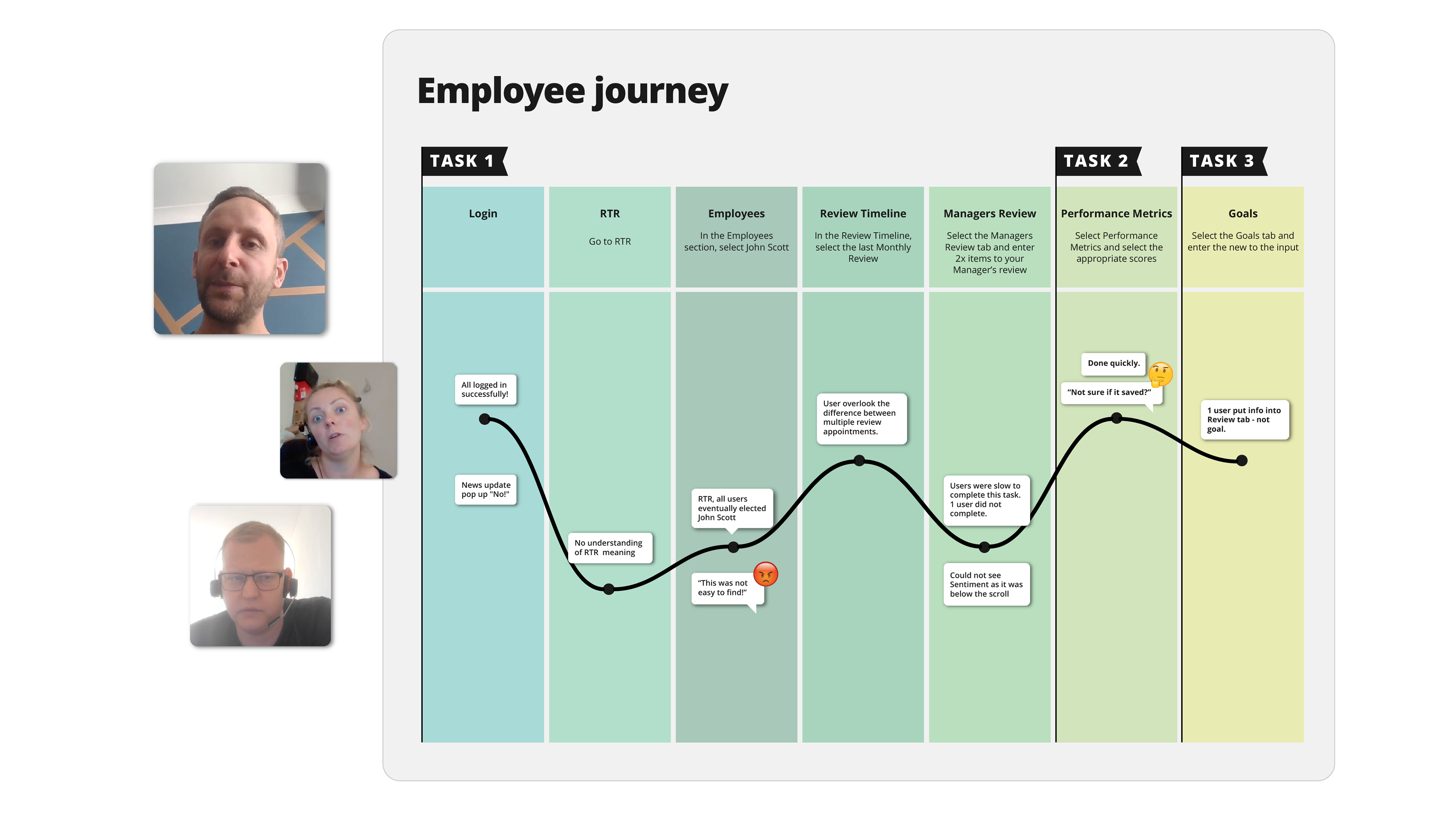
Mapping the user journey
To keep everyone on the same page, I designed a suite of user journey maps, to highlight the positives and focus everyones attention on the users pain points. The maps became a go to reference for the product owners, and helped them to prioritise their objectives.
Reporting and supporting
Finally, I produced an indepth report of the UX research findings, documenting what had been collectively observed in the usability tests, and outlining the shared insights gained. Crucial to the report was a series of recommendations which were classified according to viability and feasibility. Certain 'low hanging fruit' items were identified as easy to solve tasks, to deliver immediate improvements.
The product owners changed the name of the feature to 'Reviews' and immediately, the ammount of visitor traffic increased. Other user interface components were repositioned for greater visibilty and clarity, and accessibility was given greater priority to facilitate users with dexterity challenges.
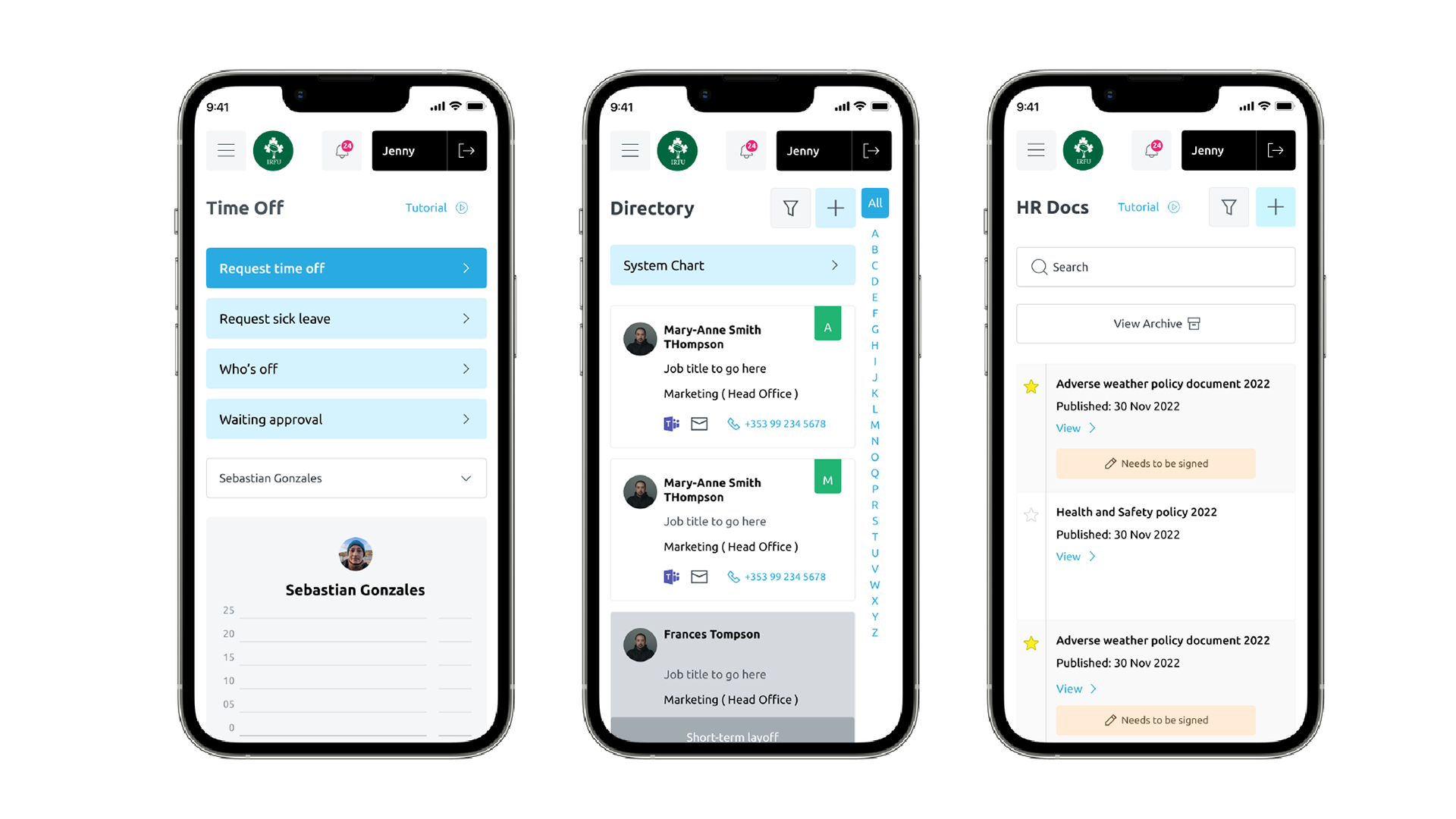
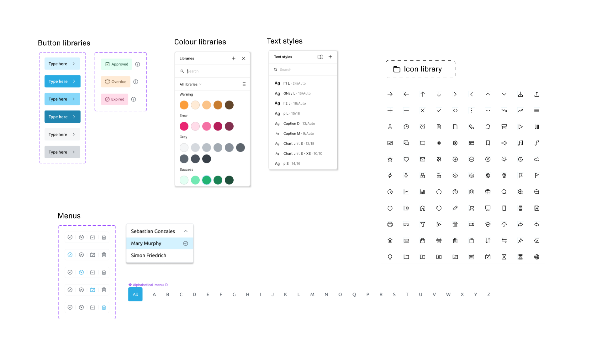
A modern user interface
As competitor products were constantly improving their UX with modern UI and design systems, I was tasked with redesigning the user interface and developing a design system to reduce the lead time to design and handover features to the dev team. I created a full design system of colours, buttons, text styles, nenus etc in Figma and shared handover documentation via Zeplin.